
Choose the right fonts… or else.
Since content is king to users, then you should know that it is incredibly important that within your San Diego WordPress design you use the correct typography or font. It is important to note that font does not only refer to the choice you make regarding the type of print, but also the size, arrangement and the overall page layout. The underlying principle of why this is essential as the typing is just as important as choosing the right combination of colors. In fact, if you were to think about it, the color choice as well as the font are not seen separately by visitors, but rather as a whole.
When it comes to web typography the two most important principles that you must keep in your mind first and foremost are legibility (individual words are easy to read), and readability (ability to read a long blocks of copy and paragraphs). Without these two considerations in place, your content will not get read in the first place, thus defeating the point of having a WordPress website.
It is not recommended that you use more than two fonts on your website – otherwise you strip away the integrity of both your website and the fonts you are already using. Pick full typeface “families,” with regular, italic, semi-bold, bold, etc. That will give you different choices when it comes to headlines, subheads and captions. Don’t use more than one or two text alignments in your paragraphs. Employ eye gravity layouts to your advantage – our minds are accustomed to read top to bottom or left to right.
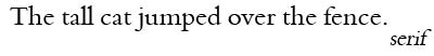
Serif versus Sans Serif fonts
When deciding on the appropriate typography of your website, it is worth mentioning that you have five basic types. While the monospace, cursive and fancy are mostly used for headings, the Serifs and Sans Serifs are the most commonly used fonts for the text body incorporated in a page. The difference between a “Serif” and a “Sans-Serif” are the little hands, hooks and feet that appear at the ends of letters. “Sans” means without, so “Sans-serif” indicates fonts with the absence of said hands, hooks, and feet. The text that you are currently reading on this blog is a sans-serif.

Even though currently there are a lot of debates regarding the advantages of using Serif or Sans Serif fonts in San Diego WordPress design, the truth is that you can get the maximum effect from using both of them alternatively.
In terms of body copy (paragraphs of text), sans-serif is a better option than serif. There are several reasons for this. First, large paragraphs of text use a small font-size. Having all of those extra serifs in the content, therefore, adds a lot of busy-ness to those paragraphs of text, making the content more challenging to read. On the other hand, serif fonts are a good choice for headlines and headers, and when making reference to your business, as they can make it appear to be established. Serif fonts are more classic, timeless styles of fonts (think of Latin Roman letterforms or old-fashioned book lettering), while sans-serif fonts are considered much more modern.

While you might feel the temptation to go overboard and add some elaborate style on some of the titles or keywords, you would be making a mistake. You need to tread carefully here. This is very similar to what we suggested in our post on color: use a stylized font ONLY when you want to draw attention to a single, particular point. That point has to be very important to warrant the use of an elaborately-styled font.

That being said, it can work. But on the other hand, using simple fonts will generally bring you the biggest advantages, since after all, visitors are interested in reading your content easily and fast.
What is the correct font size?
The answer to this question is that it depends on the content and colors you choose for your San Diego WordPress design. At this point, it is important to note that some experts in the field recommend not using any font size whatsoever. They justify their suggestion by the fact that you are setting limits to the types of browsers that can open your website. Considering that the mobile devices became the favorite browsing tool lately, you can see how you will be losing a lot of visitors and potential customers if you use fonts not suited to the mobile internet browsing experience. Overall, the best approach as they see it would be to use percentages since they are more adaptable to browsers and users.
Adding a touch of style to your fonts
Even if you are tempted to add a certain font style to draw attention to the title of an article or a certain area on the page, when it comes to websites, simple is usually a synonym of elegant and stylish. Therefore, if you feel that your content is too simple and you are looking for an ingenious and graceful way to highlight certain ideas, then the solution would be to use the most common typography attributes. Using italic, underline, caps, capital letters, bold or writing a word in a different color in your San Diego WordPress design are more than enough to draw the attention of a visitor.
To learn ways to add spice by adding unique fonts to a WordPress website, check out our blog post: 7 Simple Steps for Adding Cufon Text to Your WordPress Website. Some good distinctive unique fonts you can create using this method include: Bergamo, Crimson, Gentium, Latin Modern Roman, Liberation Serif, Linux Libertine, plus many more…

Chad Faith is a blogger and professional search engine optimization and online marketing writer and full-time content creator from Florida. He writes with eclectic writing styles and knows articles need to be keyword-focused in order to generate a higher click rate in addition to a fun and engaging writing style for SEO purposes.
Connect