If you were to hop into a time machine and jump even just five years back in time, the web would look like a very different place. With the advent of new technologies like HTML5 and CSS3, the internet is now a playground for web developers. While in the past the focus was on what could be done with the internet, the onus is now on how it can be done. In essence, all web developers have reached roughly the same level in terms of technical function, and now compete in terms of user experience and how visitors interact with these technologies. The front runner in terms of user experience has to be responsive web design. In a nutshell, responsive design means that no matter what screen or resolution the user is viewing the site on, the site itself will adapt to display in the right way. But how does this impact web marketing, and could it be ushering in a new era for online marketers?
The basics of responsive web design
Prior to the rise in the use of mobile devices like smartphones and tablets, many people used the web in the same way: via a desktop or laptop computer at a certain resolution. This meant that web developers could easily look at their design on the most common resolutions and account for the experience of at least a high proportion of visitors. These days, of course, that’s all changed. With more and people using smartphones and tablets to browse the web, developers need to be sure that the site looks its best on all sorts of displays. That means that the person with a 1024×768 monitor must have as good an experience as someone on a iPhone. That’s no easy task, but with responsive design it can be done. There’s an easy way to check if a site uses responsive design: just resize your browser window – you’ll find that the layout actually changes as the window does.

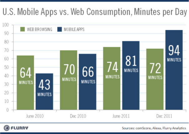
Mobile apps are quickly outpacing traditional web consumption, as this Alexa graph shows.
Responsive design and web marketing
So how do these two things interact with one another? Well, more than you might think. In many cases, the central focus of web marketing is to drive users to a specific call to action. This could be a sign up form, a ‘buy’ button, or any other form of high level interaction. Now imagine this scenario: you’ve developed a squeeze page (for want of a better term) that relies on layout to drive users down the page. They arrive from a search engine after looking for specific terms, then land on your page and get hooked into your compelling content. On a laptop or desktop, the journey is easy to follow, and results in plenty of signups or user actions.

But look at this same page on an iPad or a BlackBerry and you’ve got an entirely different experience. In fact, sometimes even the difference between 16:9 and 4:3 monitors can be enough to put the brakes on your user flows. With responsive web design on your landing page, you can feel confident that no matter how a user lands on your page, their experience is fine-tuned to maximise user actions and therefore your return on investment.
Responsive web design on company sites

For many internet marketers, it’s not all about squeeze pages and organic SEO, it’s also about the good old fashioned company website. Whether users arrive via PPC or word-of-mouth, the site needs to be as user friendly as possible. Good UE can mean the difference between a site that really sells and one that flounders. And responsive web design is the cornerstone of this process. In a world when there are limitless possible resolutions and display types, you need to be sure your site ‘works’ for every combination. Responsive web design will allow you to formulate a specific user flow for each variant, so that whenever you’ve got visitors on multiple devices, you know that each of them can find their way around the site easily and know how to get in touch with ease. And remember: when responsive web design really works, the user experience will be so natural and fluid, so most people won’t even notice (yes, that’s a good thing).
——–
Sarah Chubb is a freelance writer from England who specialises in writing about human psychology. Understanding people and their behaviour is her main speciality and she uses those skills to assist her company insurance marketing team develop good user experiences on all device sizes.


